“Blue is the closest color to truth.” Steven Tyler
“I try to live in black and white, but I’m so blue…” Billie Eilish
“I seen a lot of women / But she never escaped my mind, and I just grew / Tangled up in blue.” Bob Dylan.
“I spend a lot of my time looking at blue; The colour of my room and my mood.” Kate Bush.
“Blue is the only color which maintains its own character in all its tones; it will always stay blue.” Pablo Picasso
“The deeper the blue becomes, the more strongly it calls man towards the infinite.” Wassily Kandinsky
Welcome to the online exhibition “The Color BLUE” on my platform. Here you will discover a striking selection of posters from the worlds of music, cinema, and advertising – all united by their dominant use of blue, a color rich in visual and emotional resonance.
Blue is, first and foremost, a color of calm and serenity. In nature, it evokes the vastness of the sky and the depth of water, carrying a sense of coolness, distance, and tranquility. Yet blue can also suggest melancholy and introspection — as reflected in the expression “feeling blue.” In design and advertising, blue often stands for trust, professionalism, and stability — qualities that lend credibility and quiet confidence to visual communication.
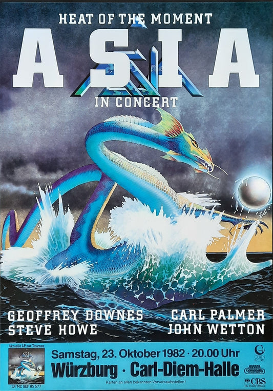
In music, blue has become both a mood and a metaphor. The very term “the blues” captures the deep emotional currents of longing, sadness, and soulfulness. Visually, blue suits posters that aim to convey depth, reflection, or a sense of cool restraint. The selected posters communicate not only style but also emotion — suspended between sensitivity and sophistication.
In film and cinema, blue takes on further symbolic layers: it represents introspection, longing, and spirituality. It is often described as a “rational” and “contemplative” color, one that suggests calm but also internal tension. Many of the posters in this exhibition reflect that duality — whether through a film character bathed in blue light or through advertising imagery where blue draws attention differently than the fiery pull of red.
Throughout art history, blue has held a privileged place. The ancient Egyptians used lapis lazuli to depict the divine and eternal. During the Renaissance, ultramarine — made from the same precious stone — was the most expensive pigment, reserved for the robes of the Virgin Mary. Centuries later, Pablo Picasso’s “Blue Period” turned the color into a symbol of melancholy and humanity. Henri Matisse used blue to express freedom and lightness, most notably in his cut-outs, while Yves Klein transformed the color itself into an artwork with his iconic “International Klein Blue.” For these artists, blue was not merely a hue — it was a state of mind, a bridge between the physical and the spiritual.
The use of blue in poster design is therefore never accidental. It shapes mood, evokes emotion, and guides the viewer’s gaze — powerful yet understated. The posters in this exhibition do more than recall bygone eras; they invite us to reconsider how color defines our perception of music, cinema, and commercial art.
Let this journey through blue inspire you: discover how shades from radiant sapphire to soft sky blue tell stories, awaken emotions, and conjure memories of sound, film, and design. Here, blue is not just a background color, but a deliberate artistic choice — a feeling, an atmosphere, an experience.
May you find inspiration as you explore this collection — and sense the quiet power and infinite depth of the color blue in all its facets.
Original posters. No reprints. Authenticity guaranteed.